
Hi ladies and gents! Many of you, if not most, know about the company Coastal Scents. They've been around a while and were among the first companies to popularize pre-made eye shadow palettes like the 88 color palette. They also used to market supplies to make your own cosmetics as well as brushes, soap making, bath bombs, etc. Now they offer a variety of finished products that are quite affordable, including loose pigment products, pressed products, bath products, mascara, pencils, etc.
I have had a wishlist of their pressed eye shadow pans called Hot Pots accumulating for quite some time. A good majority of the neutral colors on that list were sold out, so I decided to wait to purchase. There are currently 375 shades available, although that could change if they decide to discontinue or add more shades. At any rate that is more than PLENTY to choose from. The pans are magnetic and will work with any freestyle palette or in one of the few that they have avialable on the site. The best part is they are only $1.95 per color! A few times per year, they also have them on sale at a steal for $0.99! It's not always predictable when those sales occur, so it's best to sign up for their email list and follow them on social media for sale alerts. Beware, a ton of people wait for those sales to load up, so many coveted shades sell out very, very quickly!
I ordered 80 shades in all. I scoured the comments on their Instagram account and it didn't take long to find a 25% discount code that worked site-wide. Always look for a code and most of the time you will find something. My total after the discount was a mere $117. Any order at $50+ qualifies for free 2 day priority shipping in the U.S. We got a snow storm here in Kentucky, so my package was delayed by one day and I got it on Wednesday. Still very fast considering I ordered Friday night. The shadows have matte, satin, and shimmer finishes. As with many brands, the matte finishes are a little patchy and chalky. They are still very buildable and blend out well enough. Most of the satin and shimmer finishes have great color payoff and layer very well.
Get ready for quite a few photos. I took these in natural light with no flash on my iPhone. I'll try my best to briefly describe each shade. Click on the photos for a larger view! Alright, let's get to it! Below is the first group. The shades left to right starting at the top are: Cloud White, White Silver, Vanilla Sky, Chamois Nude, Flesh Tone, Nude, and Gypsy Stone.

White Cloud is just your standard matte, creamy white. Nothing mind blowing, but a nice shade to have. White Silver is a shimmering white with a slight silver sheen. Vanilla Sky is a light, fleshy satin finish that makes a nice eye highlight. Chamois Nude is a fleshy matte nude and reminds me of MAC's Blanc Type but a smidge darker. Flesh Tone is a warm, shimmering nude that leans slightly peach. Nude is a satin finish and more neutral than the previous shade. Gypsy Stone is a satin, light-medium grey toned brown.

Next is Tuscan Terra Cotta, Oatmeal Tan, Cocoa Diamond, Camel Taupe, Concrete Jungle, Frosty Taupe, and Bermuda Sand.

Tuscan Terra Cotta is a satin, light warm shade. The name really fits! Oatmeal Tan is a slightly deeper and matte version of the previous shade. it makes a fantastic transition color. Cocoa Diamond is a light, satin, warm brown. It has the orange tone with a brown sheen. Camel Taupe is somewhere between a satin and matte finish. It's similar to the previous shade, but more orange and less brown. Concrete Jungle is another satin and is definitely more brown than Cocoa Diamond. Frosty Taupe is also a light-medium satin. It's a taupe that has that slight orange tone. Bermuda Sand is a light, matte sandy color. It's neutral with a barely there yellow tone. Another great blending shade!

The shades below are: Light Taupe, Oktoberfest, Harvest Brown, Barista, Coconut Husk, Kokomo Cafe, and Timeless Taupe.

These shades are all matte. Lots of variety for blending! Light Taupe is slightly warmer and deeper than Bermuda Sand. Oktoberfest is Oatmeal Tan's darker sister. Awesome for adding deep warmth to the crease area. Harvest Brown is similar, but has less warmth. Barista is similar to Harvest Brown, but even less warm. Coconut Husk is a pinch lighter and more neutral than Barista. Timeless Taupe is a neutral taupe that has the same medium depth as the rest of the group. These may not look all that special, but when blending other colors and getting that gradient effect, these are a must in my opinion!

Next we have Boca Mocha, Deep Roast, Brownstone, Ash Grey, Steel Grey, Gunpowder, and Incognito.

Boca Mocha is a medium/deep, warm brown satin that has a nice sheen without being a shimmer. Deep Roast is a deep, matte warm brown shade. Brownstone is a cooler, deep matte brown. Ash Grey is also a matte finish that is a medium/deep standard grey. Steel Grey is smoother like a satin, but has the sheen of a shimmer. Almost metallic, dark silvery grey tone. Gunpowder is like a deep charcoal brown satin. It looks warm and cool at the same time. My brain can't decide, but it's a beautiful color! Incognito is a satin, but sooty black. It has a few little sparkles floating around, but it doesn't transfer to the skin. This one is an impressive black guys and gals!

Next is Aluminum Taupe, Light Plum, Foxy Pink, Thulian Pink, Magenta Pink, Cinnabar Rose, and Fine Wine.

The lighting made these slightly deeper than they are in person. Aluminum Taupe is a satin-shimmer (to me anyway), and is a light, taupey champagne color. Light Plum is a light, shimmery pinky plum that needs a little building to be opaque. I bet it would do well applied wet. Foxy Pink is a medium, satin, rosey pink that has a nice sheen. Very pretty! Thulian Pink is a shimmer and more intense than the Foxy Pink. It's probably my favorite pink! Magenta Pink and Cinnabar Rose are both matte and beautiful, but if it were up to me, I would swap their color names with one another. Fine Wine is matte and a more neutral mauvey version of the Magenta shade.

The next shades are Lavender Lace, Amethyst, Elven Midnight, Regalia Purple, Edgy Eggplant, Raisin Berry, and Violetta.

The light washed out some of the purple, but I don't alter the color in swatches with editing. Lavender Lace is a soft, satin lavender. Perfectly named. Amethyst....look at it! It is slightly less pink than the photo, but this is a gorgeous shimmery gem. Just like it's name. I can't even give it justice! Elven Midnight. This is a medium satin with a nice almost metallic sheen. It's a taupey shade of violet and grey. Regalia Purple is satin finish that looks almost like a deep violet-periwinkle that has that touch of soft blue. Edgy Eggplant is a matte royal violet-indigo shade to the best of my describing abilities. Raisin Berry is on of those that sells out quickly. It's a satin finish that is like a copper, cranberry, berry shade all rolled into one. Will make all eye colors pop! Violetta is a medium/deep matte, warm violet shade and would be great for blending and layering.

Next we have Amber Bronze, Burnt Umber, Dark Chocolate, Cherry Chocolate, Chocolate Berry, Platinum Blue, and Niagara.

Amber Bronze is a beautiful coppery bronze with a satin finish. Again, named just right! Burnt Umber is another deep, matte, warm brown, but less orange than some previous shades. Dark Chocolate is a satin that is a deep chocolate color that almost has a golden something something going on in the background. The next two: Cherry Chocolate and Chocolate Berry are very similar. Both are deep, satin shades of chocolate. The Chocolate Berry shade has a slightly more pinky-red sheen to it than the Cherry Chocolate. You wouldn't NEED both, but hey, subtle differences. Paltinum Blue is a shiny satin finish that is platinum in color, but has an icy blue reflect. Hard to describe! Niagara....can we just take a moment? This photo does zero justice to this color. It is a satin finish that is a minty blue-green with a golden sheen. If I didn't know any better, this was harvested from the scales of a bombshell mermaid! My favorite out of the entire collection I own!

Moving onto Vibrant Blue Green, Blue Hawaiian, Brandeis Blue, Rainstorm, Midnight Blue, Deep Eggplant,and Dark Golden Olive.

Vibrant Blue Green is a darker, matte minty shade. It's not teal and it's not a kelly green, but it is a pretty one! Blue Hawaiian is a shimmery satin that looks like the Caribbean ready to take you on vacation. Fun pop of color! Brandeis Blue is a satin finish and one that I had to build up a little bit. It is also that beautiful ocean blue, but slightly darker than Hawaiian Blue. Rainstorm is a deep satin shade of grey/blue. Like a storm cloud. Will make the baby blues pop! Midnight Blue is a very deep matte shade of navy that leans indigo. It's absolutely gorgeous! Deep Eggplant is a bluer and darker version of Midnight blue. A matte finish with silver sparkles in it that do transfer when swatching, unlike the black shade earlier. Dark Golden Olive is a satin finish and is the perfect deep shade of golden olive...just like the name says!

Below is Amazonian Ice, Elven Green, Jewel Teal, Grape Vine, Shamrock Green, Fresh Chive, and Pinehurst.

Amazonian Ice is a shimmering lime green. Would be a fun kick of color! Elven Green is a satin finish that I had to build up to opacity. It is more of an apple green and could be used with bright greens or gold to bring out either quality in this color. Jewel Teal....*angels singing*. This one is a satin finish that is just as the name states....a jewel toned teal. Very hot for the warm months! Grape Vine is a satin finish with an almost metallic sheen. It's a deeper green with a reflection of gold. One of those that would make hazel eyes look more green! Shamrock Green is a matte and is similar to the Vibrant Blue Green from earlier, but it is definitely more green and less blue. Fresh Chive is a matte and is the ultimate, punch your face off, green! Haha! Pinehurst is also a matte and is a very deep green, like pine needles.

Next we have Citron, Solar Flare, Sunflower Petal, Gypsy Green, St. Topaz, Sunset Gold, and Gold Strike.
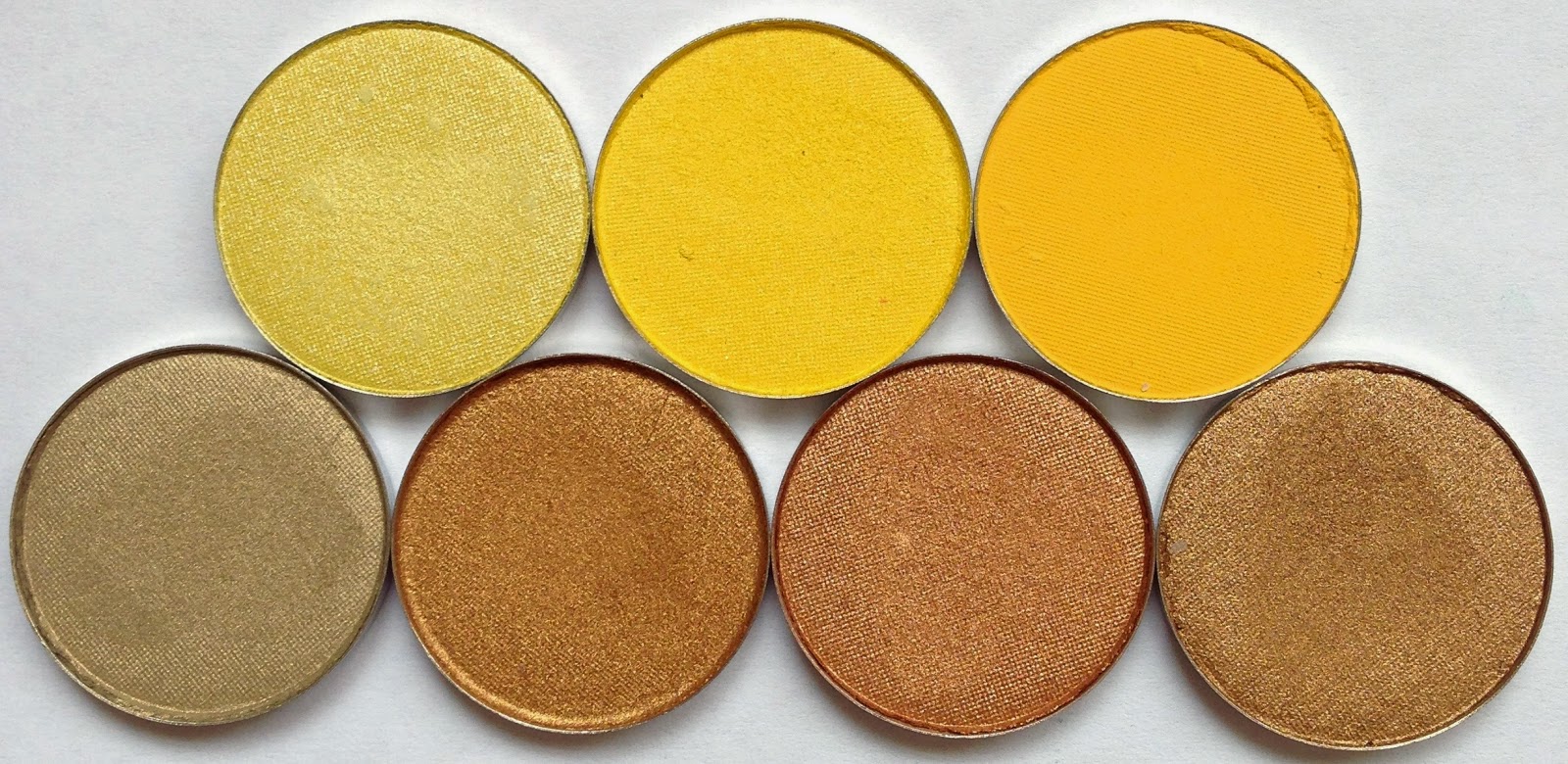
Citron is a light shimmering yellow with a slight gold sheen. This would add a beautiful highlight to the inner corner. Solar Flare has that same reflect of gold, but more intense in the shine and the yellow. It's bright and beautiful! Sunflower Petal is a deeper, matte, mustard yellow. It would make a nice combo with some of the shimmer colors to balance out a look or to build up and add a pop of color. Gypsy Gold is a satin finish, run of the mill gold, but it almost has a slight pinky champagne color when the light hits it. St. Topaz, Sunset Gold, and Gold Strike are the same shimmering finish with subtle differences. They are all coppery golds, but different levels of the copper coming through.

Lastly we have Persian Peach, Orange Crush, Tea Rose Pink, Peach Puff, Peachy Keen, Peach Brew, Pink Frost, Bright Copper, Watermelon, and Vibrant Red.

Persian Peach is a matte true peach. This will be a fantastic blending color and maybe even a browbone highlight for warm tan skintones. Orange Crush is also a matte finish and is a medium toned bright orange, just like the soda! Would be a fantastic bright transition shade applied with a light hand or a pop of color applied more opaque. Tea Rose Pink is a satin finish. Very soft pink, just like the palest pink rose in a garden. Peach Puff is a matte, soft, pinky peach. This would be beautiful to transition deeper pinks or on the lid with a black winged liner. Peachy Keen is a satin that reminds me of orange sherbet for some reason, with a kiss of strawberry. It's so pretty! Peach Brew comes off as a matte finish with some sparkle in it. It's deeper in the swatch than it is in person. An orangey peach that I will probably also double as a blush! Pink Frost is a shimmering baby pink that has a kiss of that peach tone, but it's very subtle. Bright Copper is just that! A satin finish bright copper, just like a brand new penny. Watermelon is a satin finish, soft red that has a pink sheen to it. Kind of like watermelon candy does. Lastly is Vibrant Red. This is a matte finish and as most matte reds, has to be built up. It does stain a bit, which is also typical. Nonetheless, it is always good to have a red, just in case you ever find yourself needing one for a very specific look!

Thanks for sticking with this blog post! It's certainly a long-winded one! Feel free to leave any questions in the comments and don't forget to check out my YouTube and social media. These products can be found on www.coastalscents.com
As always, never forget....you are beautiful!
Hi there. Thank you for such an exhausting swatch post- very helpful for choosing which colors to get. :) I wanted to ask- which shade would you recommended as a transition/blending shade for medium tan, neutral/slightly olive tone, light brown skin? (Indian ethnicity) thanks in advance :)
ReplyDeleteYou're very welcome and thanks for the comment! Based on your description, take a look at the 3rd group of shades I posted above starting with the shade Light Taupe. That entire grouping could suit your needs based on whether or not you are going for a warmer or cooler tone. I even use those for my light-medium Caucasian skin with a very light touch, but they can very applied a little more for deeper skin as well :)
DeleteGoodness, I apologize for the typos. I used my phone and it won't allow me to edit. Oops!
DeleteLol no problem at all-- and thanks a bunch :)
DeleteThis comment has been removed by the author.
ReplyDeleteCan u put name on the hot pots. It's kinds of confusing cross matching the name
ReplyDeleteCan u put name on the hot pots. It's kinds of confusing cross matching the name
ReplyDeleteI LOVE this post!
ReplyDeleteI'm one of those rare weirdos who practically wets herself over a good matte or satin neutral eyeshadow, and Coastal Scents offers so danged many!
Best of all, they're cruelty-free, and second-best of all, they're inexpensive.
I ordered Timeless Taupe during a recent sale, and I'm ridiculously excited to get it.
I'm hoping it can replace a favorite Kiko shadow that was (sob!) discontinued.